Items & the Item Creator
Items are plain ScriptableObjects. Author them in the Item Creator window with a live tooltip preview, or straight in the inspector with a click-to-paint footprint editor.
The ItemData asset
One ItemData asset defines what an item is; every copy that sits in an inventory is an ItemInstance pointing back at it. Create one via Assets▸Create▸Inventory System▸Item Data — or use the Item Creator below, which fills in everything correctly.
| Field | Type | Description |
|---|---|---|
| Item Name | string | Display name shown in tooltips and logs. |
| Description | string | Long-form tooltip body text. |
| Icon | Sprite | Square-canvas sprite with transparency; rendered aspect-preserved inside the footprint. |
| Item ID | int | Unique, non-negative identifier. Save files store only this ID — duplicates silently break loading. |
| Width / Height | int | Grid footprint in cells (e.g. 2×4 two-hander). Minimum 1×1. |
| Can Rotate | bool | Allows 90° right-click rotation in grids. Mutually exclusive with Stackable. |
| Stackable / Max Stack Size | bool / int | Same-ID items merge on drop up to Max Stack Size. Mutually exclusive with Can Rotate. |
| Category | enum | One of Weapon, Armor, Consumable, Tool, Misc, QuestItem. |
| Rarity | enum | One of Common, Rare, Epic, Legendary, Unique — drives the item's background tint and aura. |
| Is Equippable / Equip Slot | bool / enum | Marks the item for equipment panels and picks its target slot type (Helm, MainHand, Ring1…). |
Resources.LoadAll returns whichever duplicate it finds first. The Item Browser flags collisions in red.The Item Creator window
Window▸NullBolt▸Inventory System▸Item Tools opens the Item Creator and Item Browser docked together as one workspace. The Creator is a single form — name, description, icon, footprint, category, rarity, a Plain/Stackable/Rotatable behavior toggle, and equipment settings — with a live preview on the right that renders the item tile and its tooltip card using the exact same code the runtime uses. What you see in the preview is what players see in Play mode.
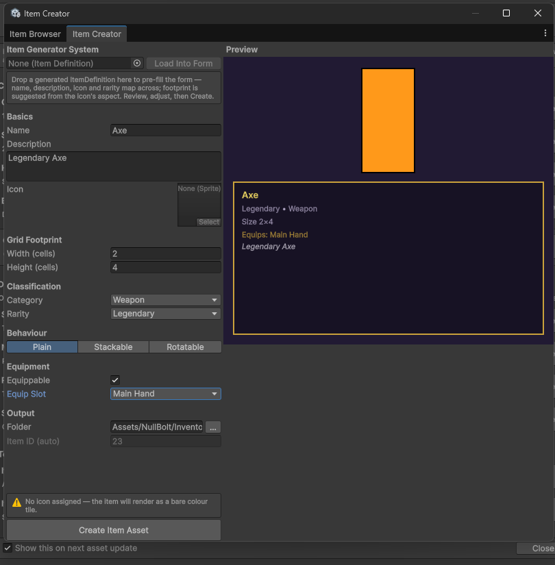
Worth knowing:
| Behavior | Description |
|---|---|
| Auto ID | New items get the next free project-wide ID automatically — no collision bookkeeping. |
| Validation | Creation blocks on an empty name or an equippable item with no slot; it warns (without blocking) on a missing icon or an icon whose aspect fights the footprint ratio. |
| Output folder | Defaults to the asset's Resources/Items folder, so new items are immediately visible to save/load and the demo item pools. |
| Item Generator import | If our Item Generator System asset is installed, an import row appears — details in Importing from Item Generator System below. |
Importing from Item Generator System
Own both assets? The Item Creator detects our Item Generator System automatically (by reflection — no assembly references, no setup; without it the row simply isn't rendered). Generate an ItemDefinition over there, then in the Creator: drop it into the Item Generator System row → Load Into Form → review → Create Item Asset.
| What maps | Description |
|---|---|
| Name / Description / Icon | Copied straight across. |
| Rarity | Matched by name — Common/Rare/Epic/Legendary/Unique map directly; Magic and Uncommon become Rare; Mythic/Artifact become Unique; anything unrecognized falls back to Common. |
| Footprint | Suggested from the icon’s aspect ratio (square → 2×2, tall → 1×N, wide → N×1, capped at 4 cells) — it’s a starting point, adjust before creating. |
| Stats, affixes, sockets, value | Intentionally not imported — ItemData models placement (footprint, stacking, rarity, equip slot), not gameplay stats. Keep rolled stats on the generated ItemDefinition or your own components and link them by item ID. |
ItemData asset that saves, stacks, and equips like any hand-authored item.The Item Browser
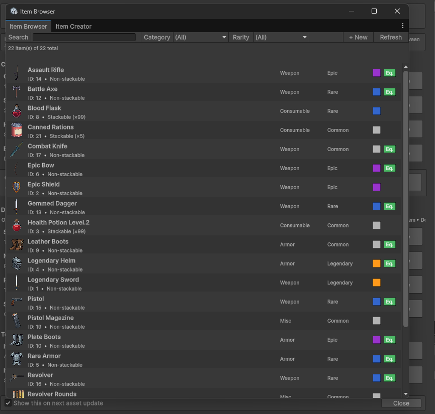
The Browser tab lists every ItemData in the project with search, category/rarity filters, and sortable columns. Select several rows (Ctrl/Shift-click) and the bulk-edit panel appears — set rarity, category, or stacking across the whole selection in one undoable step. Duplicate (N) copies items and assigns each copy a fresh, non-colliding ID.
Custom footprint shapes
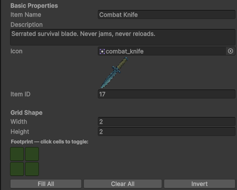
The ItemData inspector draws the footprint as a click-to-paint grid — Fill All, Clear All, and Invert included. Painted shapes feed GetShape() and the occupied-cell count.
Rarity colors
Rarity tints come from a palette asset, not hardcoded values. Defaults: Common is light gray, Rare blue, Epic purple, Legendary orange-gold, Unique red. To restyle them, create a palette via Assets▸Create▸Inventory System▸Rarity Palette and either assign it to RarityPaletteSO.Current at startup or drop a RarityPaletteApplier component into the scene and point it at your palette — the bundled RarityPalette_PixelDark is applied that way in the demo scenes.
using InventorySystem;

[SerializeField] private RarityPaletteSO myPalette;

void Awake()
{
    RarityPaletteSO.Current = myPalette;   // null = built-in defaults
}
Runtime item state
Per-instance state lives on ItemInstance: Position, StackCount, IsRotated, a Condition float (0–1, for durability systems), and a CustomName (falls back to the ItemData name when empty). All of it persists through save/load.
ItemInstance blade = inventory.GetItemAt(new Vector2Int(0, 0));

blade.SetCondition(0.42f);              // clamped to 0..1
blade.SetCustomName("Greatsword of Ash");
blade.OnInstanceChanged += i => RefreshTooltipUI(i);
The 22 sample items
Two ready-made sets ship under Resources/Items/: a 13-piece fantasy set (IDs 1–13 — swords, bows, potions, boots, rings) and a 9-piece tactical set in Items/Tactical/ (IDs 14–22 — rifles, magazines, rations… and one Legendary Toilet Paper). They're normal ItemData assets — duplicate and reskin them freely, or use them as footprint references. IDs 1–22 are taken; the Item Creator starts yours at 23.